The human eye, a marvel of biological engineering, perceives color in ways profoundly impacting our emotional and psychological states. Neutral color palettes, primarily composed of whites, grays, beiges, and blacks, offer a unique design advantage: their inherent versatility. Unlike vibrant hues that can quickly overwhelm a space, neutrals provide a calming backdrop, allowing textures, patterns, and carefully chosen accent colors to take center stage.
This exploration delves into the science of color perception as it relates to interior design, examining how neutral palettes can be manipulated to create a spectrum of moods, from serene tranquility to sophisticated elegance.
Understanding the psychological effects of color is crucial. Neutrals, for instance, are often associated with feelings of peace and order, making them ideal for spaces designed for relaxation, such as bedrooms. However, the interplay of light, texture, and strategically placed accent colors can dramatically shift the perceived mood. This guide will navigate the complexities of neutral palettes, providing practical design strategies and scientific insights to help you craft a space that reflects your personal style and enhances your well-being.
Defining Neutral Color Palettes
Neutral color palettes, the foundational elements of versatile interior design, encompass a range of hues that blend seamlessly and provide a calming backdrop for bolder accents. These palettes, characterized by their lack of strong chromatic intensity, offer a timeless elegance and adaptability, making them a popular choice for homeowners seeking a balanced and sophisticated aesthetic. Understanding the nuances of neutral palettes, from their psychological effects to their practical applications, is key to unlocking their full design potential.
Classic Neutral Color Palettes in Home Decor
Classic neutral palettes typically revolve around variations of white, beige, gray, and brown. These colors, found in nature and readily available in a wide spectrum of shades, form the basis for countless design schemes. For example, a warm neutral palette might incorporate creamy beiges, taupe, and warm grays, evoking feelings of comfort and coziness. Conversely, a cool neutral palette might feature icy whites, cool grays, and charcoal, creating a more modern and minimalist feel.
The variations are extensive, allowing for personalized expression within the neutral framework.
Psychological Impact of Neutral Colors in Interior Design
Neutral colors exert a significant influence on our perception of a space and, consequently, our emotional state. Research suggests that lighter neutrals, such as off-white and light gray, can create a sense of spaciousness and serenity, promoting relaxation and reducing stress. Darker neutrals, like charcoal gray or deep brown, can convey sophistication and drama, adding a sense of warmth and intimacy, especially when paired with appropriate lighting.
The absence of overly stimulating colors allows for a sense of calm and focus, making neutral palettes ideal for bedrooms, meditation spaces, or home offices.
Versatility of Neutral Palettes in Different Room Styles
The adaptability of neutral palettes extends across diverse interior design styles. In minimalist interiors, neutral colors form the canvas upon which clean lines and simple furnishings are showcased. In traditional settings, they provide a classic backdrop for ornate details and antique pieces. Even in contemporary spaces, neutrals can be used effectively, often paired with metallic accents or bold geometric patterns to add visual interest.
The key lies in understanding how the nuances of shade and texture can transform the overall mood and style of a room.
Examples of Distinct Neutral Color Palettes
The following three palettes demonstrate the versatility of neutral colors in creating different moods:
Calming Palette: This palette features soft, muted tones that promote relaxation. Imagine a space painted in a gentle, creamy white, complemented by linen-colored textiles and light gray accents. The overall effect is serene and inviting, ideal for a bedroom or spa-like bathroom.
Energetic Palette: In contrast to the calming palette, an energetic neutral scheme utilizes brighter, more saturated shades of neutral colors. Think a warm, sandy beige as the dominant color, accented with warm grays and touches of deep brown, creating a vibrant yet grounded atmosphere. This palette works well in living rooms or dining areas.
Sophisticated Palette: This palette relies on a sophisticated interplay of deep grays, charcoal, and off-black. Subtle textural elements, such as velvet upholstery or a marble countertop, add depth and luxury. This palette creates a sense of elegance and refinement, suitable for a formal living room or study.
Incorporating Texture and Pattern with Neutral Colors
Neutral color palettes, while elegant in their simplicity, can sometimes feel stark or impersonal without the addition of texture and pattern. These elements introduce visual interest and depth, transforming a potentially monotonous space into one that is both calming and engaging. The interplay of textures and patterns against a neutral backdrop allows for a sophisticated and layered design, enhancing the overall aesthetic appeal and creating a more dynamic environment.
The careful selection of these elements is key to achieving a balanced and harmonious design.
The human visual system is highly sensitive to texture and pattern. Our brains process these visual cues rapidly, influencing our perception of space and affecting our emotional response to an environment. Rough textures, for example, can evoke a sense of rustic charm, while smooth surfaces contribute to a feeling of sleek sophistication. Similarly, geometric patterns can create a sense of order and modernity, while floral patterns bring a touch of romanticism and nature indoors.
By strategically incorporating these elements, designers can manipulate the visual experience to achieve a desired mood or ambiance within a neutral-toned room.
Examples of Texture Adding Visual Interest
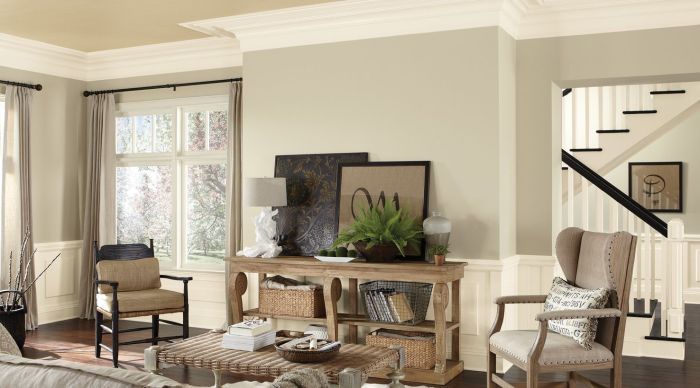
Textured elements significantly impact the perceived depth and richness of a neutral space. Imagine a living room painted in a soft beige. Introducing a chunky knit throw blanket on the sofa immediately adds visual weight and tactile interest. The interplay of light and shadow on the knit creates a dynamic surface, far more engaging than a smooth, plain fabric.
Similarly, a woven jute rug adds a natural, earthy texture that contrasts beautifully with the smooth surfaces of furniture and walls. A wall adorned with textured wallpaper, perhaps with a subtle linen or grasscloth effect, introduces a level of complexity and sophistication that a plain painted wall lacks. Even seemingly minor details, like the grain of a wooden coffee table or the subtle texture of a ceramic vase, contribute to the overall textural richness of the space.
Pattern Integration with Neutral Color Schemes
Different patterns interact uniquely with neutral color palettes. Geometric patterns, with their sharp lines and precise shapes, introduce a modern and structured feel. A bold chevron pattern in a charcoal gray on a cream-colored sofa, for example, adds a contemporary edge to a classic neutral scheme. Floral patterns, conversely, introduce a softer, more romantic element. A subtle floral print on curtains or cushions in muted tones can add a touch of femininity and warmth without overwhelming the neutral base.
Abstract patterns, with their free-flowing forms and unpredictable designs, inject an artistic and expressive element. An abstract rug with muted blues and grays on a light beige floor creates a visually interesting focal point without disrupting the overall calmness of the neutral palette.
Mood Board: Textures and Patterns in a Neutral Scheme
Imagine a mood board showcasing a serene neutral space. The backdrop is a soft, warm gray wall. A large, chunky-knit throw in cream and beige is draped over a linen sofa in a similar color. A woven jute rug in a natural beige tone anchors the seating area. On a side table sits a ceramic vase with a subtly textured surface, filled with dried pampas grass.
A framed print with an abstract design in muted greens and grays hangs above the sofa, adding a touch of artistic flair. The overall effect is one of calm sophistication, where the textures and patterns subtly enhance the elegance of the neutral color scheme. The jute rug’s natural fibers offer a rustic contrast to the smooth linen sofa, while the knit throw’s texture introduces a comforting warmth.
The abstract art provides a focal point, balancing the organic feel of the pampas grass and jute rug. The muted colors in the artwork maintain visual harmony with the rest of the room’s palette.
Comparative Effects of Various Textures in a Neutral Room
| Texture | Visual Effect | Emotional Response | Example |
|---|---|---|---|
| Woven (e.g., jute rug) | Adds visual depth and organic feel | Relaxing, natural, earthy | A woven jute rug in a living room |
| Smooth (e.g., glass coffee table) | Creates a sense of sleekness and modernity | Clean, sophisticated, minimalist | A glass-topped coffee table in a minimalist living room |
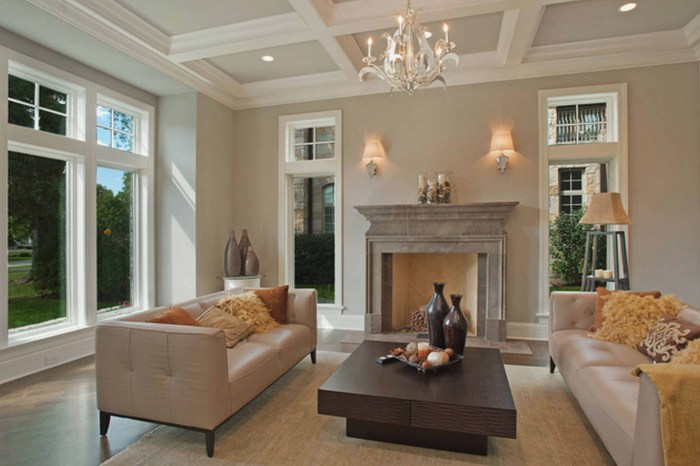
| Rough (e.g., stone fireplace) | Introduces a rustic and tactile element | Warm, inviting, grounded | A stone fireplace in a living room with neutral walls |
| Flocked (e.g., velvet cushions) | Adds luxurious and tactile appeal | Luxurious, comfortable, sophisticated | Velvet cushions on a neutral-toned sofa |
Neutral Color Palettes in Different Room Types
The versatility of neutral color palettes extends to every room in the house, influencing mood, perceived space, and overall aesthetic. Understanding the psychological and practical implications of color choice in different environments is key to creating harmonious and functional living spaces. The impact of light, the room’s function, and the desired atmosphere all play significant roles in selecting the ideal neutral scheme.
Neutral Palettes in Bedrooms
Bedrooms benefit from calming, restful neutral palettes. Warm neutrals like creamy whites, soft beiges, and greige (a blend of gray and beige) promote relaxation and sleep. Cooler neutrals, such as light grays or muted blues, can create a serene and airy atmosphere, especially in rooms with limited natural light. The use of texture through bedding, rugs, and curtains adds depth and visual interest without overwhelming the sense of calm.
For instance, a bedroom painted in a soft greige, accented with linen bedding in ivory and taupe, and a wool rug in a subtle oatmeal shade, would create a sophisticated and peaceful retreat. The psychological impact of these warm, muted tones is well-documented, reducing stress and promoting restorative sleep.
Neutral Palettes in Living Rooms
Living rooms, being social spaces, can accommodate a broader range of neutral palettes. Depending on the desired ambiance, one might opt for warmer tones to create a cozy and inviting atmosphere or cooler tones for a more modern and sophisticated feel. The use of varying shades of neutral within the same family (e.g., different shades of gray) can add visual interest and depth without disrupting the overall sense of harmony.
Introducing pops of color through accessories, such as throw pillows or artwork, allows for personalization without compromising the foundation of the neutral palette. For example, a living room with walls painted in a warm, light gray could be furnished with a charcoal gray sofa, ivory armchairs, and a natural-fiber rug. Adding accents of deep teal or burnt orange through throw pillows and artwork injects personality and warmth.
Neutral Palettes in Kitchens
Kitchens, being high-traffic areas, benefit from durable and easy-to-clean neutral palettes. Lighter neutrals, such as white, off-white, or light gray, can make the space feel larger and brighter, while darker neutrals, such as charcoal gray or taupe, can create a more sophisticated and modern feel. However, in smaller kitchens, lighter shades are generally preferred to avoid making the space feel cramped.
The practicality of neutral tones in a kitchen is significant; spills and stains are less noticeable on lighter surfaces, and darker neutrals offer a timeless elegance that won’t clash with changing trends in kitchen design. For instance, a small kitchen could use white cabinetry, light gray walls, and a beige backsplash to maximize the sense of spaciousness.
Designing a Neutral Color Scheme for a Small Living Room
Maximizing space in a small living room relies heavily on the strategic use of light and color. A predominantly light and bright neutral palette is crucial. Walls painted in a soft white or very light gray will reflect light, making the room feel larger and more airy. Furniture should be chosen in light or medium shades of neutral, avoiding dark colors that can visually shrink the space.
Mirrors strategically placed can further enhance the illusion of spaciousness by reflecting light and visually expanding the room. For example, a small living room could utilize off-white walls, a light gray sofa, a cream-colored rug, and a large mirror positioned above the fireplace or opposite a window to create an open and airy feel. The use of minimal furniture and streamlined design further contributes to the sense of spaciousness.
Neutral Color Palettes in Modern Versus Traditional Homes
In modern homes, neutral palettes often lean towards cooler tones, clean lines, and minimalist aesthetics. Think light grays, crisp whites, and subtle charcoal accents. The focus is on simplicity and functionality. In contrast, traditional homes often incorporate warmer neutrals, such as creamy beiges, warm whites, and soft browns. Textures play a more prominent role, with materials like wood, linen, and velvet adding richness and depth.
Modern spaces tend towards a sleek, uncluttered look, while traditional spaces embrace a sense of coziness and layered textures. For example, a modern living room might use a monochromatic palette of light gray and white, while a traditional living room might incorporate various shades of beige, cream, and taupe, accented with wooden furniture and patterned textiles.
A Neutral-Toned Bathroom
Imagine a bathroom with walls painted in a soft, warm white, reminiscent of fresh linen. The flooring is a light gray porcelain tile, providing a clean and modern feel. The vanity is a sleek, minimalist design in a matte white finish, complemented by a brushed nickel faucet. Accessories include fluffy white towels, a woven basket for toiletries, and a framed print with a muted, natural landscape.
The overall effect is one of serene calmness and understated elegance, showcasing the versatility of neutral tones in a functional space. The use of natural light is maximized by keeping the color palette light and reflective, further enhancing the sense of spaciousness and tranquility.
Adding Pops of Color to Neutral Spaces
Neutral palettes, while elegant and versatile, can sometimes feel sterile without strategic injections of color. The key is to introduce vibrant hues thoughtfully, leveraging color psychology and design principles to create a space that is both visually appealing and emotionally resonant. This involves understanding how colors interact with each other and the impact they have on our mood and perception of the environment.
Accent Colors for Beige and Gray Palettes
Three accent colors that harmoniously complement a beige and gray base are deep teal, burnt orange, and dusty rose. Deep teal, with its cool undertones, provides a sophisticated contrast to the warmth of beige and the neutrality of gray. Burnt orange introduces a vibrant yet earthy element, balancing the cool tones and adding visual interest. Dusty rose, a muted pink, offers a softer contrast, lending a touch of femininity and warmth without overwhelming the palette.
These colors, when used judiciously, can elevate a neutral space without disrupting its inherent calm.
Strategic Color Placement in Neutral Rooms
Incorporating pops of color effectively hinges on strategic placement. Overly saturated colors in large quantities can disrupt the serene atmosphere of a neutral space. Instead, consider using accent colors in smaller, well-defined areas. A teal armchair in a beige living room, for instance, acts as a focal point, drawing the eye and adding a visual anchor. Burnt orange cushions scattered on a gray sofa introduce bursts of color without overwhelming the overall scheme.
Dusty rose throw pillows on a bed with gray linens add a touch of softness and visual interest. The effectiveness lies in the controlled application of color, emphasizing strategic placement over broad application.
Metallic Accents in Neutral Palettes
Metallic accents – gold, silver, and bronze – offer a unique way to add depth and sophistication to a neutral palette. Gold, with its inherent richness and warmth, complements beige beautifully, adding a touch of luxury. Silver, on the other hand, lends a modern, sleek feel, particularly effective when paired with gray. Bronze offers a mid-tone option, providing a bridge between the coolness of silver and the warmth of gold, creating a more balanced and versatile aesthetic.
These metallics can be introduced through lighting fixtures, decorative objects, or even furniture hardware, subtly enhancing the overall design without competing with the neutral backdrop. For example, gold-framed mirrors can brighten a room while adding a touch of elegance, while silver picture frames can create a modern and minimalist look.
Color Psychology and Atmospheric Creation
Color psychology plays a significant role in creating a specific atmosphere. For instance, incorporating cool colors like blues and greens can promote relaxation and tranquility. In a neutral space dominated by beige and gray, introducing teal accents through throw blankets or artwork can contribute to a calming effect. Conversely, warmer colors like oranges and reds stimulate energy and creativity.
A few burnt orange accessories strategically placed in a primarily gray home office can subtly enhance focus and productivity. The careful selection and placement of these accent colors can significantly influence the overall mood and functionality of the space. For example, a bedroom with beige walls and dusty rose accents will create a calm and soothing environment conducive to sleep.
Lighting and Neutral Decor
Neutral color palettes, while elegant and versatile, rely heavily on lighting to reveal their full potential. The interplay of light and neutral shades dramatically affects the perceived mood, warmth, and overall aesthetic of a space. Understanding this relationship is crucial for creating a truly captivating interior. The way light interacts with these colors, particularly the subtle variations in tone and hue, dictates the final visual impact.The Impact of Different Lighting Types on Neutral ColorsDifferent types of lighting—natural, ambient, and task—each interact uniquely with neutral colors, influencing their appearance and the overall atmosphere of a room.
Natural light, with its ever-changing spectrum throughout the day, introduces dynamism. The warm glow of morning sun might highlight the creamy tones of a beige wall, while the cooler light of the afternoon might emphasize the gray undertones in a taupe sofa. Ambient lighting, responsible for the overall illumination of a room, sets the mood. Warm-toned ambient lighting, such as incandescent bulbs, can create a cozy and inviting ambiance, enhancing the warmth of lighter neutrals.
Conversely, cooler ambient lighting, often found in LED lights, can make neutrals appear more crisp and modern. Task lighting, focused on specific areas like reading nooks or workspaces, adds functionality while also subtly altering the perception of nearby neutral colors. A well-placed task lamp can highlight the texture of a linen throw pillow, making it a focal point within the neutral scheme.
Living Room Lighting Plan: A Neutral Palette
This design plan focuses on a living room with a neutral color palette, primarily using shades of beige, gray, and white. The goal is to create a balanced and inviting space utilizing a layered lighting approach that combines natural, ambient, and task lighting.Natural light is maximized through large windows, supplemented by sheer curtains that diffuse harsh sunlight while allowing ample light to enter.
Ambient lighting is provided by recessed LED downlights with a warm white (2700K) color temperature, creating a soft and even illumination across the ceiling. This ensures a consistent base level of light that complements the neutral tones. A statement pendant light fixture, positioned above the coffee table, adds a focal point and contributes to the ambient lighting, its design reflecting the overall style of the room (e.g., a minimalist design for a modern feel, a more ornate design for a traditional feel).
Task lighting is incorporated through floor lamps positioned beside seating areas, allowing for adjustable light levels for reading or other activities. These lamps use warm white LED bulbs (2700K) to maintain consistency with the ambient lighting and avoid stark contrasts. Finally, accent lighting is used to highlight specific features, such as artwork or a decorative shelf, using small, directional spotlights with adjustable heads to control the light’s direction and intensity.
These spotlights use a neutral white (4000K) light, which helps to highlight the textures and details without overpowering the room’s overall warmth.
The Effect of Light Temperature on Neutral Shades
The color temperature of light, measured in Kelvin (K), significantly impacts how neutral colors appear. Warmer temperatures (2700K-3000K) tend to enhance the warmth and richness of neutrals, while cooler temperatures (5000K-6500K) can make them appear more crisp and modern. Neutral color temperatures (3500K-4100K) offer a balanced approach.
| Neutral Shade | Warm Light (2700K) | Neutral Light (4000K) | Cool Light (6500K) |
|---|---|---|---|
| Off-White | Creamy, warm, inviting | Bright, clean, slightly cool | Stark, almost bluish |
| Beige | Rich, golden, cozy | Subdued, slightly grayish | Pale, washed-out |
| Gray | Warm gray, slightly brownish | True gray, balanced | Cool gray, almost bluish |
| Taupe | Deep, earthy, warm | Subdued, slightly muted | Cooler, more ashy |
Final Review
Mastering the art of neutral color palette design transcends simply choosing colors; it’s about understanding the interplay of light, texture, and psychological impact. By thoughtfully incorporating patterns, textures, and strategic pops of color, a neutral space can evolve from a blank canvas to a sophisticated and personalized haven. Remember, the key lies in balance – the careful orchestration of elements to create a space that is both visually appealing and emotionally resonant.
This guide has provided the foundational knowledge; now, let your creativity and the science of color guide you in crafting your perfect neutral sanctuary.
Question & Answer Hub
Can I use neutral colors in a small space?
Absolutely! Lighter neutral shades, such as off-white or light gray, can make a small room feel larger by reflecting light and creating a sense of spaciousness. Avoid dark neutrals, which can make a small room feel cramped.
Are neutral palettes boring?
Not at all! The beauty of neutral palettes lies in their ability to serve as a canvas for texture, pattern, and pops of color. The possibilities for creative expression are vast, preventing any sense of monotony.
How do I choose the right lighting for a neutral room?
Lighting is crucial. Layered lighting (ambient, task, accent) is recommended. Warm-toned lighting can create a cozy atmosphere, while cooler tones offer a more modern feel. Experiment to find what best suits your space and personal preference.
What are some affordable ways to add texture to a neutral room?
Incorporate affordable options like woven baskets, textured throw pillows, a chunky knit blanket, or a jute rug. These additions bring visual interest without breaking the bank.
How do I avoid a sterile feel with neutral colors?
Introduce warmth through natural materials like wood, stone, or plants. Incorporate varying textures and patterns to add visual interest. Strategic pops of color can also prevent a sterile feel.